Wednesday, May 21, 2014
Sunday, May 18, 2014
Thursday, May 15, 2014
Wednesday, May 14, 2014
Thursday, May 8, 2014
Another Landscape Attempt
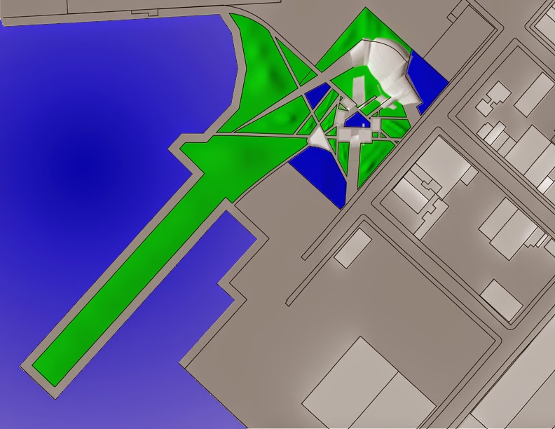
The pathways created aren't random. They're derived from the orientation of the rooms and ribs of the buildings. The wider have more importance because they lead to the major space on this site. I also used the space around the site to make green spaces and left a 20' pathway for bikers or pedestrians to walk on.
Tuesday, May 6, 2014
Landscape attempt
This site plan view shows how the landscaping of this site is very inviting. The green color indicate where grass would be and the blue indicates where there might be a small pond and last but not least the dark grey are pathways through which my guest can get to either their rooms, out door movie theater and gym.
Monday, May 5, 2014
Massing update
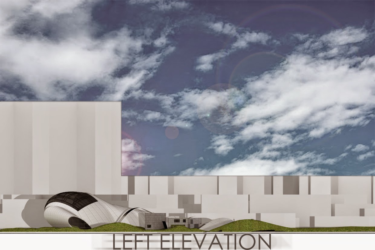
The massing of my media complex has change a little due to corruption of my flash drive. The ribs of the building act a little different then the previous massing. One of the ribs act differently because it turns into a accommodation space for my guest and it is very convenient for my guest to circulate to this building from their irrespective rooms. Last but not least the round curved space in the media complex acts as an auditorium taking its true shape and having a core that runs vertically up this space.
Subscribe to:
Comments (Atom)


